
OVERVIEW
In order to understand more about UI/UX design process, I have done a Redesign UI challenge. This article will record the process of my redesign of "BitoPro Virtual Currency Exchange iOS App".
TIME
Mar 2020
MY ROLE
Case Study
UI/UX design
. . .
Background
Since 2017, many virtual currency exchanges have been opened in Taiwan. At present, BitoPro and MAX can be said to be the top two virtual currency exchanges in Taiwan.
Today's protagonist, BitoPro, is created by the Taiwan Bitoex team, in order to make all market participants can purchase digital assets such as Bitcoin, ETH, USDT and so on in this transaction. It has high security (requires verification to open various permissions), low trading fees, and there are two interfaces for web version and mobile App for everyone to choose from.
Today's protagonist, BitoPro, is created by the Taiwan Bitoex team, in order to make all market participants can purchase digital assets such as Bitcoin, ETH, USDT and so on in this transaction. It has high security (requires verification to open various permissions), low trading fees, and there are two interfaces for web version and mobile App for everyone to choose from.
. . .
Place can be done better
As a user of a virtual currency exchange, I have used both exchange platforms, and because I have recently traded on BitoPro, I would like to use my own experience to think about whether there is anything I can do better.
After using the BitoPro App, I have sorted out a few main problems:
After using the BitoPro App, I have sorted out a few main problems:
1. The information provided by "Home" and "Market" in the Tab Bar at the bottom are similar
Both of "Home" and "Market" are all for the buying and selling markets of various currencies, and I feel they can be combined into one category.
Both of "Home" and "Market" are all for the buying and selling markets of various currencies, and I feel they can be combined into one category.
2. At the Tab Bar, we can't switch pages using the first two categories
According to the iOS Human Interface Guidelines, Tab Bar should be a function bar that can switch between various pages. However, after clicking the "Home" or "Market" in the Tab Bar to enter the market of each currency, you can no longer click "Home" or "Market" to return to the original page. Only can click the back icon on the upper left to return.
3. When buying and selling, you can't use the amount you want to spend to automatically calculate how many digital assets you should buy.
You can only set the price to buy first, then set the quantity to buy, and finally it will tell you how much it cost. But sometimes we want to set the purchase price and the money we are willing to spend, and then see how many assets we can buy.
4. If you want to view the completed order, you need to filter the viewing conditions yourself
As a user, I think it should at least show recent transaction records.
5. In the asset list, digital assets only displayed its amount but the current value.
Hope it can indicate how many Taiwanese dollars or US dollars these digital assets are equal to, so that users can easily know how their current assets are allocated.
. . .
Feedback from other users

According to user ratings and reviews in the App Store, as of March 2020, there were a total of 143 ratings, with an average score of 3.9. And 43 of them also provide comments in addition to the ratings. I sorted out and analyzed the following information:
In addition to program problems such as inability to update, unable to log in, and slow speed, it also stated that
In addition to program problems such as inability to update, unable to log in, and slow speed, it also stated that
"interface is difficult to use",
"mobile interface is too different from the website",
"function cannot be used",
"function is too simplified"
and other problems related to the UI design.
. . .
Redesign based on the research
In response to the main issues listed above, I have compiled a new Functional Map:

Next, the interface will be redesigned according to the problems listed above, hoping to create a better type of BitoPro in mind.
. . .
Before and After
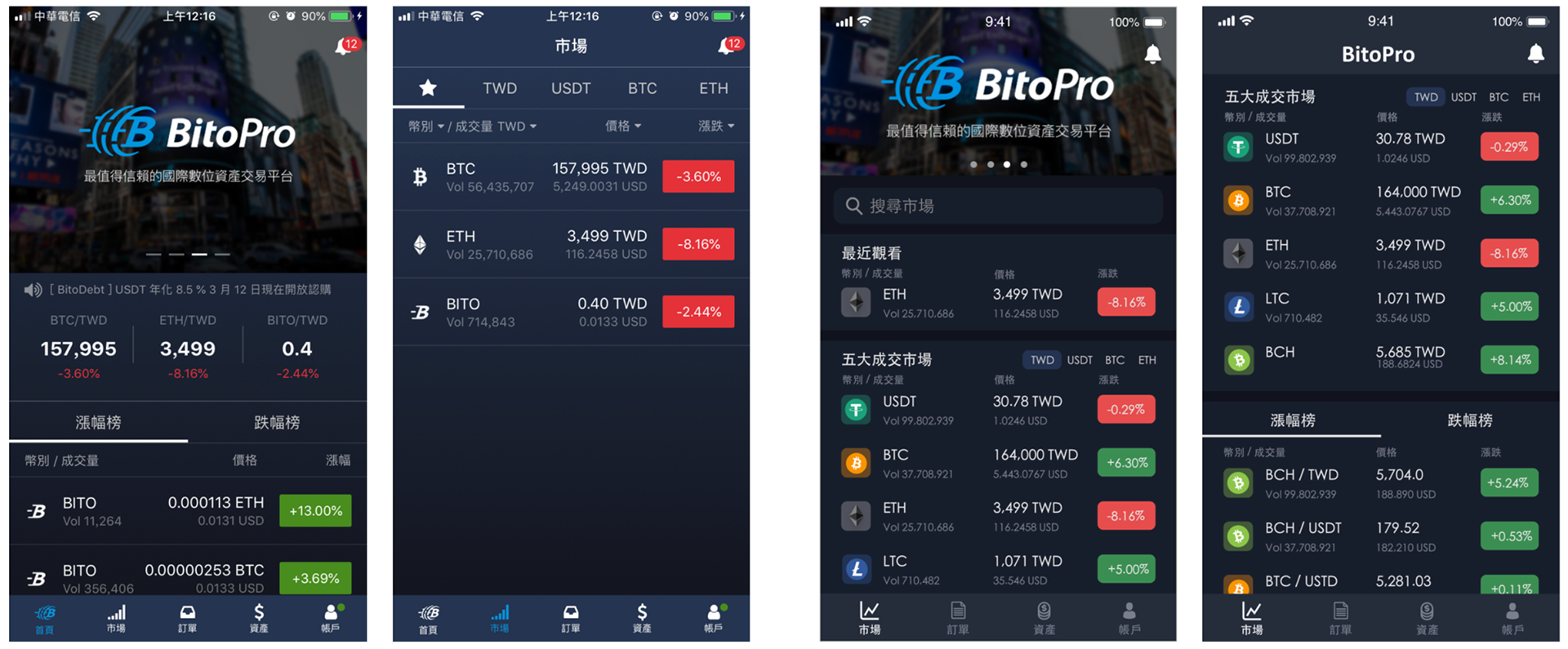
Home page (two on the left: before / two on the right: after)
• After the improvement, the two pages of "Home" and "Market" will be merged into one page, and placed in the position of one-hand operation hot zone, which is convenient for users to click.
• The advertising area at the top of the original homepage is reduced, and the function of searching the market is added, so that users do not need to slide down to find the unpopular market transactions.
• Added the "Recently Viewed" field, so that those who searched in the previous step will automatically jump to the most recently viewed, reducing the time for searching.
• Add real icons of all currencies, so that users can clearly distinguish between various currencies.
. . .

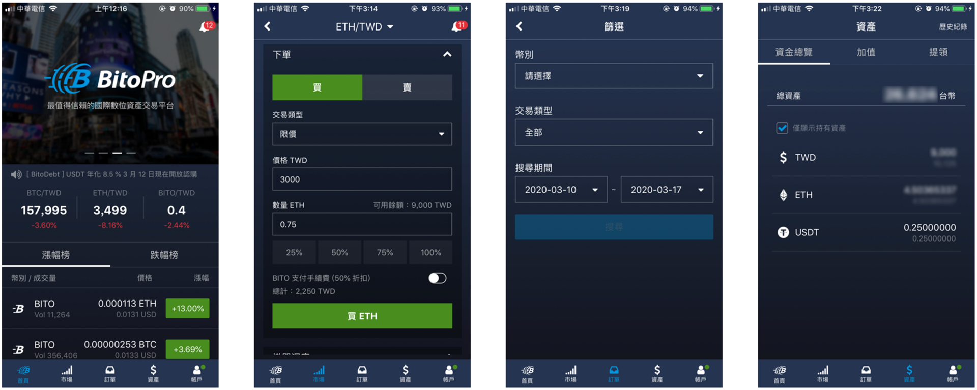
Trading page (one on the left: before / one on the right: after)
• Change the transaction type menu from drop-down menu to the left and right sliding method, so that users can clearly know which transaction types can be selected, and it is also more convenient to click.
• Because some people will get used to seeing exchanges price and come back to buy, at the upper right corner of the purchase unit price box, the information about how much the current price is equivalent to US dollars has been added, so that users can easily convert.
• Added a box to enter the total amount, so you can push back the amount you need to purchase based on the total amount you want to spend.
. . .
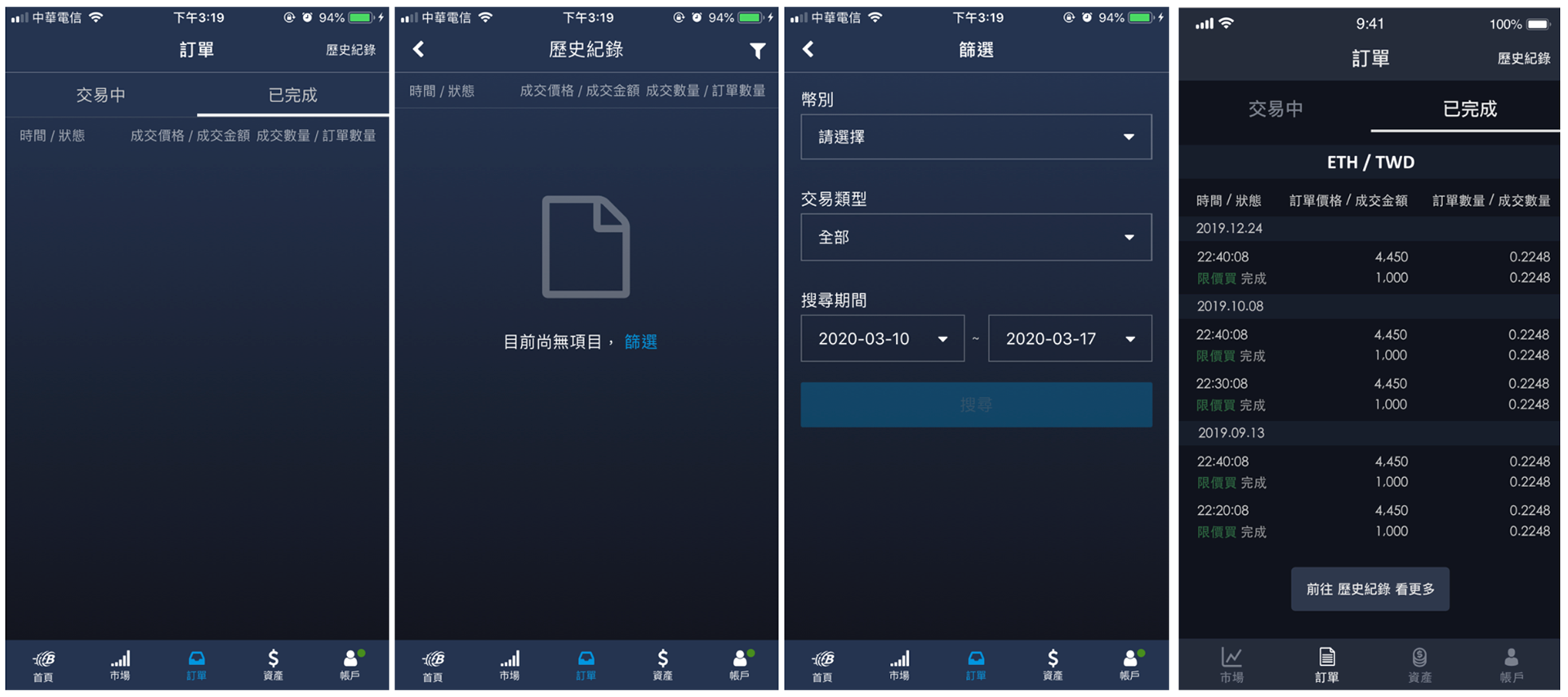
Trading history page (three on the left: before / one on the right: after)
• Originally, to view the completed transaction records, you must jump to three pages to actually see the desired information. I think it is very inconvenient to use. After the improvement, the "completed" page is changed to display the transaction records of the past six months. If you want to see more, you need to go to the historical records to filter and search.
• Add a button at the bottom of the page to allow users to jump directly to the historical record page without having to look up where the historical record is.
. . .
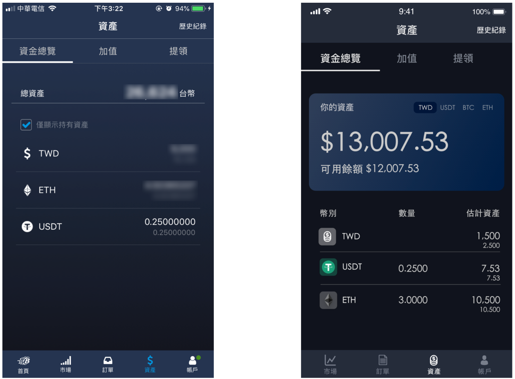
Assets page (one on the left: before / one on the right: after)
• Change the visual design of the asset overview at the top looks like a credit card, and options for different currencies are also added, allowing users to switch arbitrarily.
• The different currencies below also have their own small icons so that users can distinguish more clearly.
• The part of digital assets is different from the original display only of the quantity, the new version of the interface shows the value of the Taiwanese dollar it represents. (The top is the total assets, the bottom is the available balance)
. . .
Conclusion
Although BitoPro is a virtual currency exchange used by most people in Taiwan, you can still find many places that are not so convenient in the process of using, even more unsmooth than its competitors. I hope that BitoPro will have the opportunity to improve and enhance the user experience of the App, thereby increasing user utilization.
Through this redesign challenge, I can find that there are many details to pay attention to during the design process. Although it seemed complicated at first, but through redesign to build a learning goal step by step, I think I can still clarify and understand UI design after all. Keeping learning, keep growing!