
OVERVIEW
Maynooth Furniture is a class project from the course, User Experience Design Essentials - Adobe XD UI UX Design, on Udemy. We are helping Maynooth Furniture to build a e-commerce website for people to browse & purchase furniture for home delivery. As a class project, the teacher has set up a persona for us, we need to do the design based on her needs. Also, the website requirements are homepage, category page and product page.
Below are the design process of this project.
TIME
Apr 2020
MY ROLE
Brand identity
Wireframing
Visual design
Prototyping
. . .
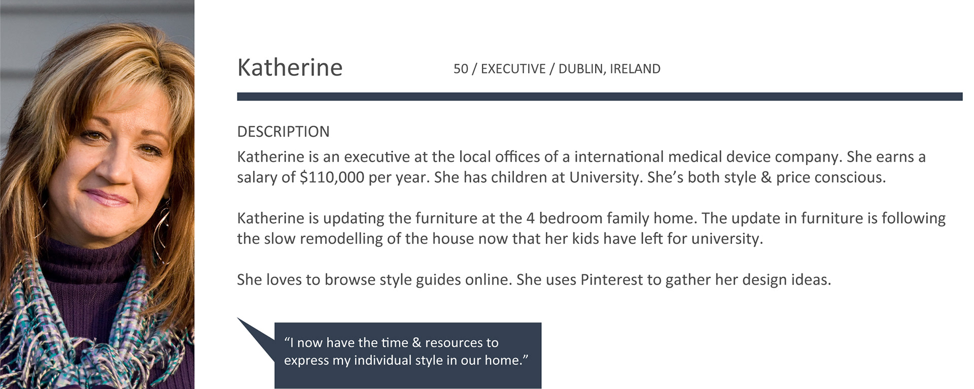
PERSONA AND USER STORY
. . .
BRAND IDENTITY
Maynooth Furniture is a new business selling affordable high-end design furniture made in Ireland. Their target audience are those who just like Katherine, a person is both style and price conscious. Also, she loves to browse style guides online and uses Pinterest to gather her design ideas. With that said, the design should be simple, clear, clean, lightweight, and engaging. The site should provide an effortless, intuitive and smooth user experience.
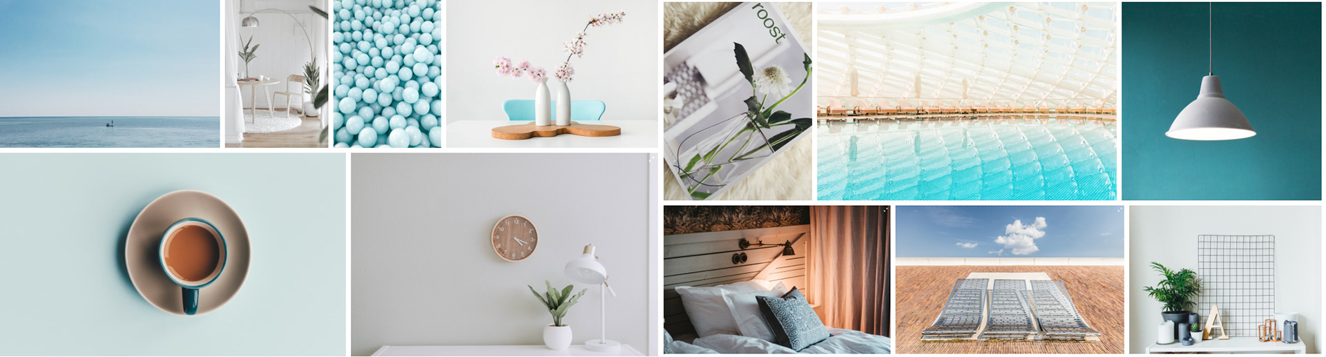
Mood board
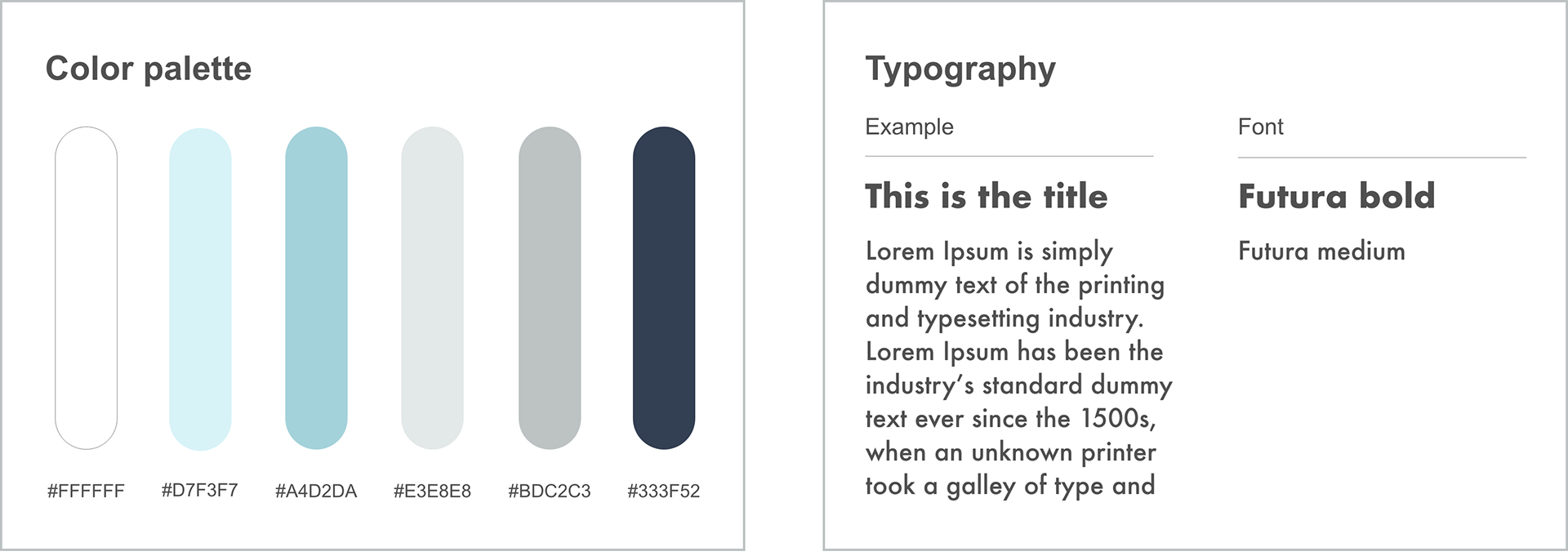
Color theme and typography
. . .
WIREFRAMES
Before drawing the wireframes, I try to listed the basic features of the project requirement by drawing UI flow with Xmind. It helped me think more clearly about how many pages should I make and the connection between each pages.
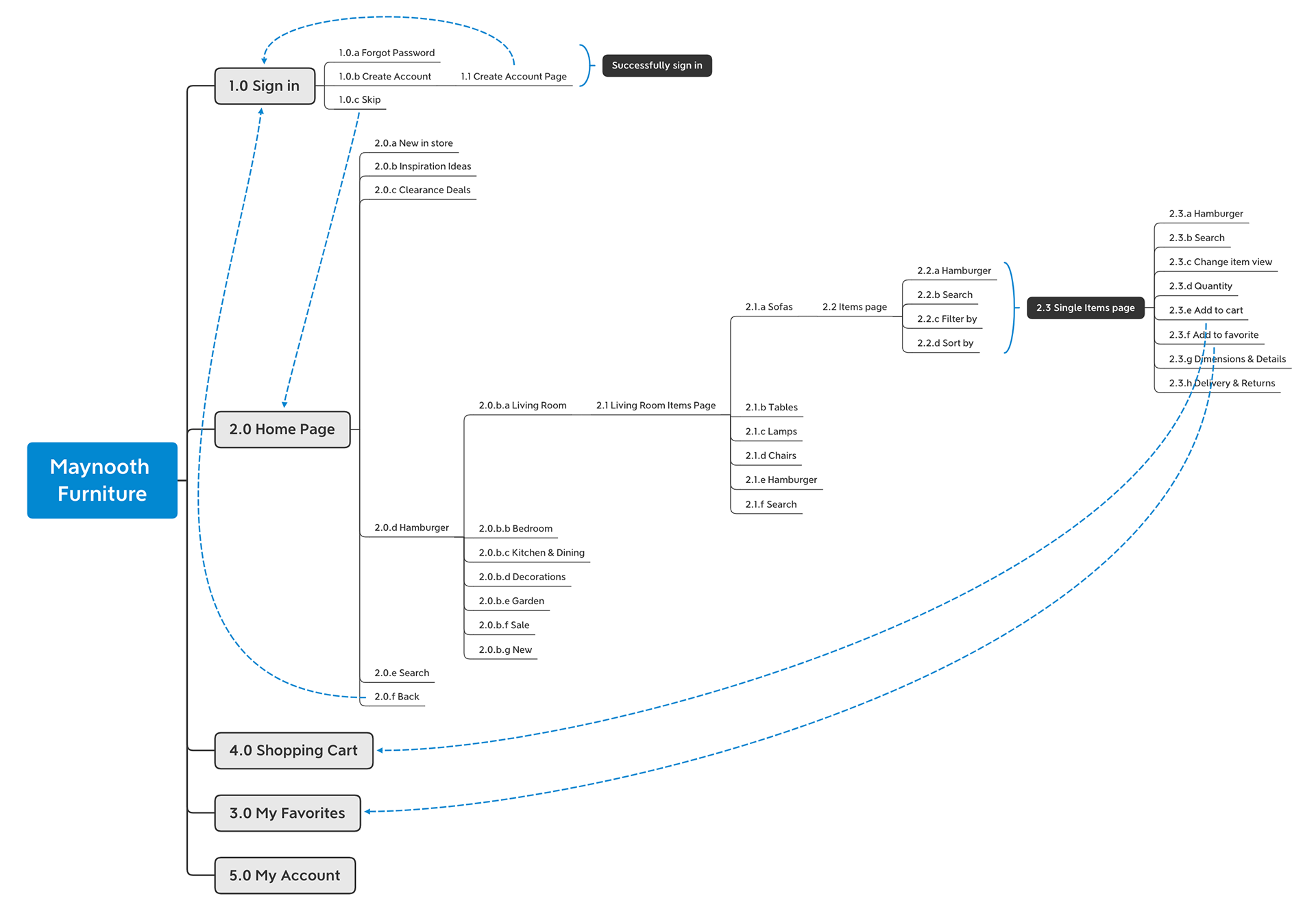
Basic UI flow
In the wireframes, all features were translated into screen-by-screen solutions with a logical flow that interlinks each other. In the graph, the blue lines stand for moving forward and the red lines mean going backwards. By following the lines, the interaction of the real users with the website was simulated. In this stage, I will check if all the discussed features are included and figure out if the flow makes sense to users.
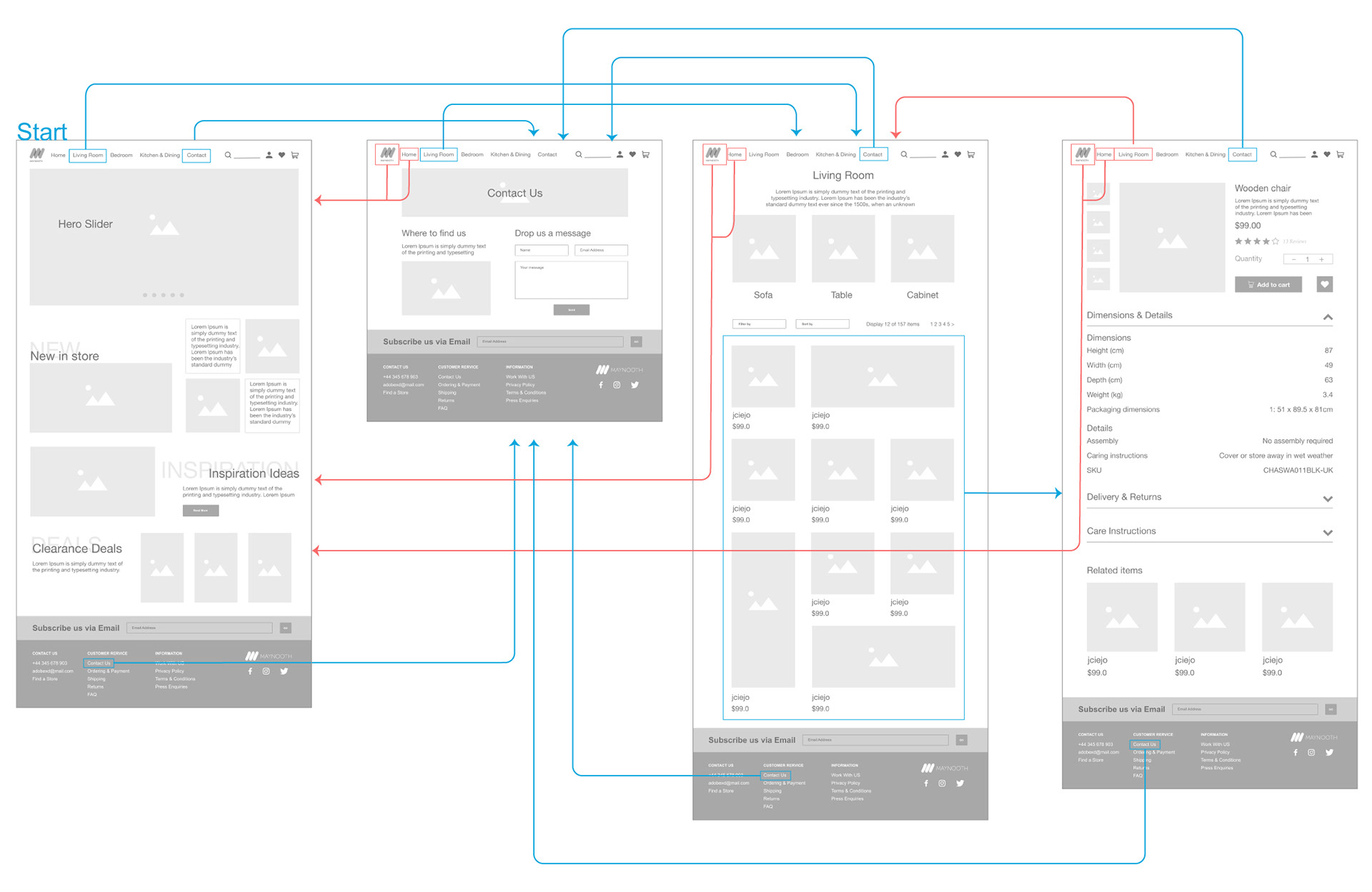
Wireframes of the web design
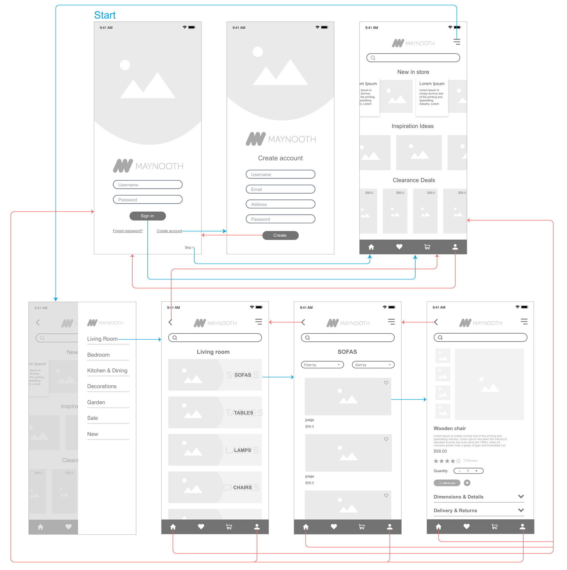
Wireframes of the mobile design
. . .
HIGH-FIDELITY MOCKUP
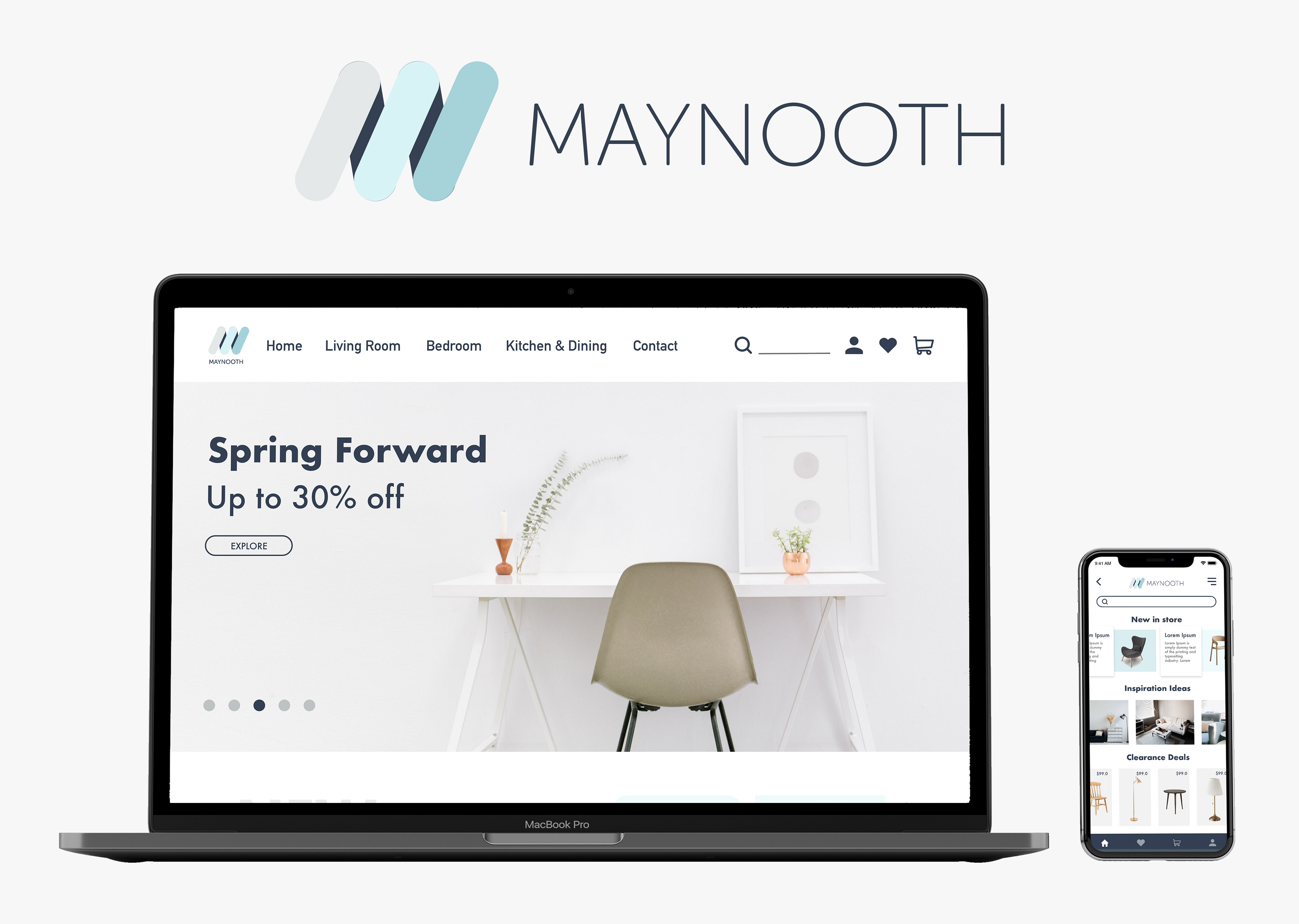
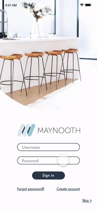
Basically the high-fidelity mockups are the screen-by-screen pixel-perfect visualization of the wireframes in detail. Light blue, white and gray were chosen as the main colors because they gave audience a feeling of lightweight, clean, and clear. The image of the furnitures are placed on a gray background, avoiding unnecessary messy background.
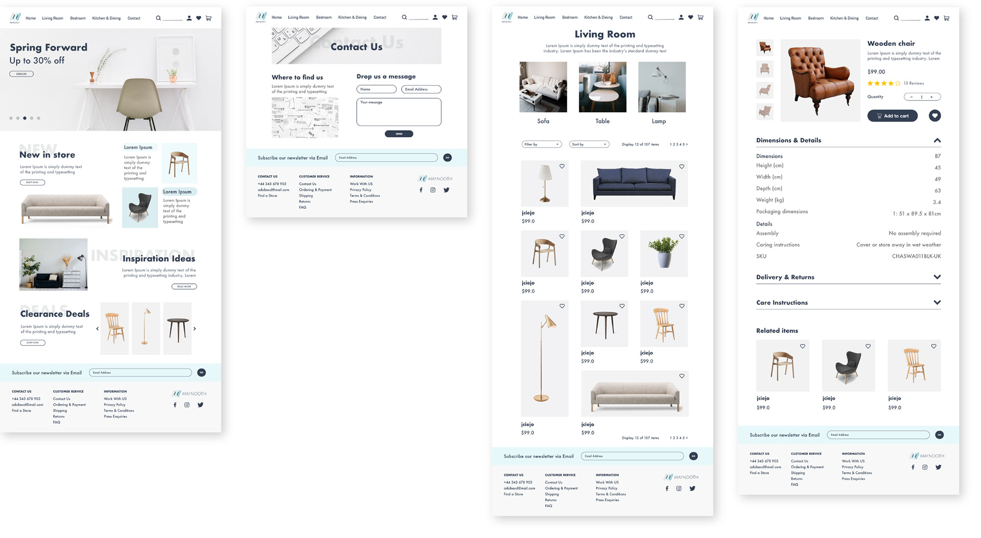
Web high-fidelity mockups
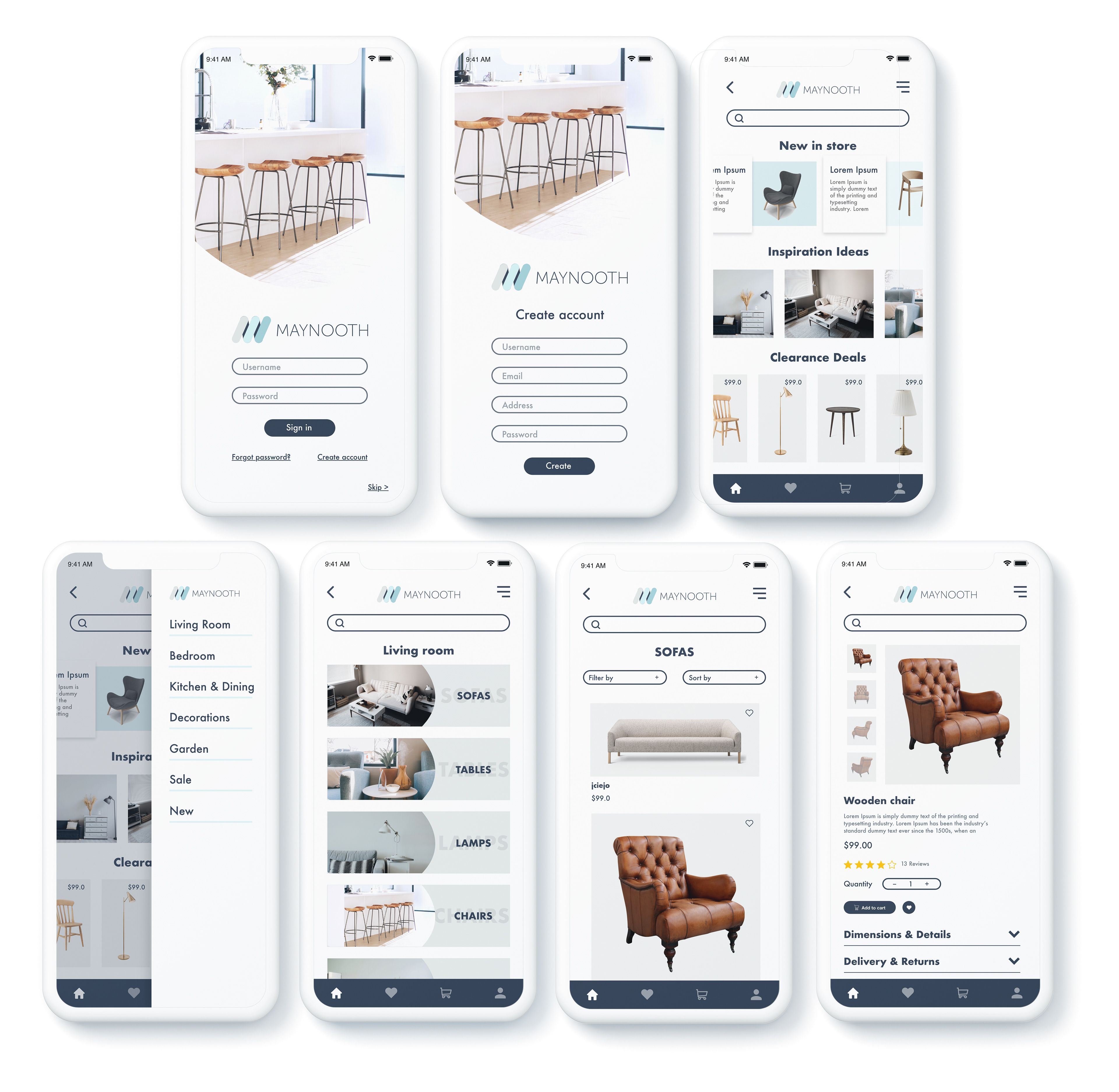
Mobile high-fidelity mockups
. . .
PROTOTYPE
CONCLUSION
I started to used Adobe XD last year for my daily UI challenge, learning the skills by myself on the internet. Since I am looking for more information on XD and getting to know the program itself better, I choose this course on Udemy. It has great UX references and a few refreshing perspectives. As well as it really helps me learn more functions of XD in the process.
For the previous works like Daily UI, I focused more on visual design, and did not start from the beginning of the research. By doing this project, I went through the whole design process and learnt a lot from it. However, I hope that I can do more user testing to make my design better next time!
Thanks Udemy and Daniel Walter Scott for providing such practical lecture. There are still much to learn to become a better designer. Keep learning, keep growing!