OVERVIEW
Since covid-19 has affected our lives, national health insurance administration in Taiwan has developed an app for people to pre-order the masks and provide some medical information. After using the app by ourselves, we think that it still has many places for improvement to make the pre-order process smoother. That's why we choose this app as our class project of UX design course in NCCU. Hope that after our redesign, this app can become better and more user-friendly.
TEAM MEMBERS
洪佩妤、莊景雲、駱郁雯、郭亭儀、王柏安
TIME
Apr 2020 - June 2020
MY ROLE
User Research
Create Persona
Lo-fi Wireframes
Visual design
Prototyping
. . .
Design Process
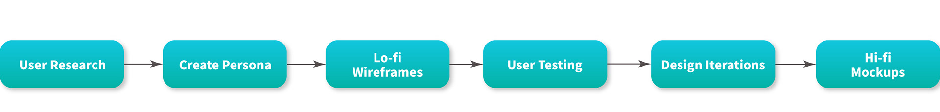
01. User Research
We want to have a more holistic understanding about the people we design for. We conducted contextual inquiry interview with 6 people to understand users’ behaviors, preferences of national health insurance mobile app and and the problems they faced during the time using it.
Contextual Inquiry Interview Key Findings
・Prefer more in-app services. Since some of functions will connect to other websites, makeing people feel inconvenient.
・Icon is not related to its function name. It's easy to make users confused what this function can do.
・Half satisfied with the status quo and the other half thought it could be better.
Flow Model
Based on the answers and the results we got from the contextual interviews, we draw some flow model to show the information flow between every user and the system elements, helping us to share the focuses and findings and reach common ground easier.
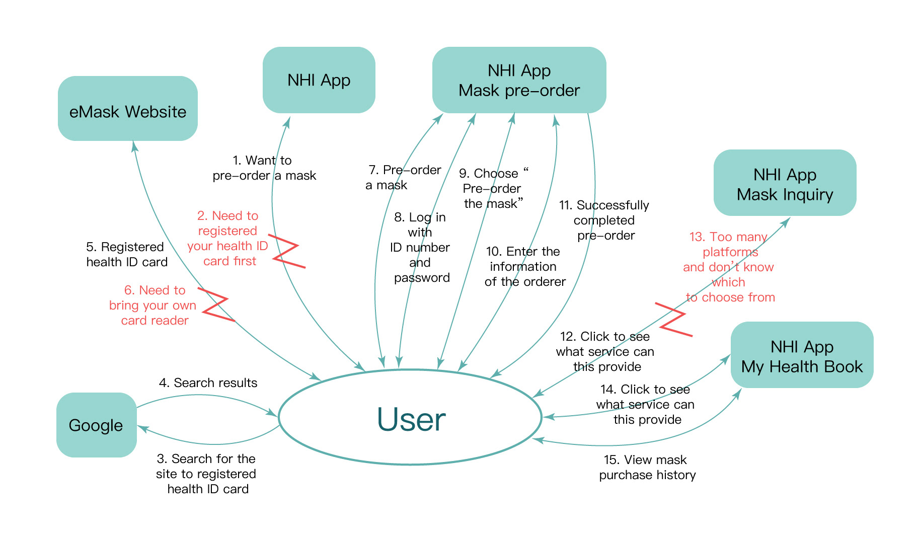
Flow model of one of our users
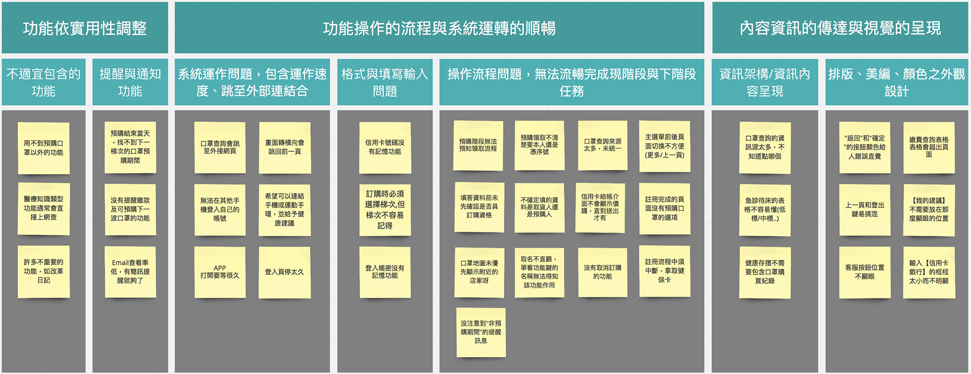
Affinity Diagram
Besides drawing flow models, we used affinity diagram to organize data and ideas as well. During this process, we figured out the pain points of the App and sorted out several aspects that can be further improved.
. . .
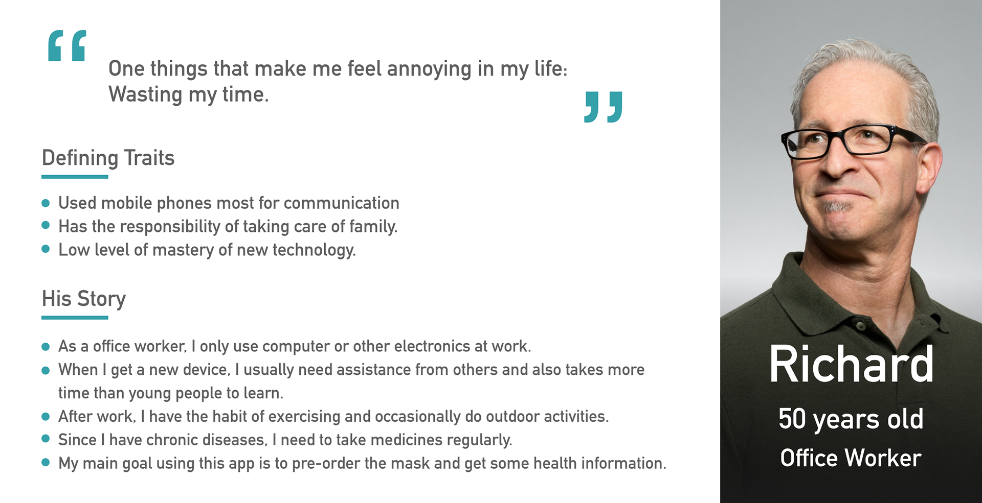
02. Persona
Based on the data and results we got from the contextual interviews, flow model and affinity diagram, we built our personas.

. . .
03. Lo-Fi Wireframes
After knowing the current problems and the targeted users' goals of the app, we try to sketch out lo-fi paper wireframes with new features. First, we sketched out our new design on paper, and discuss whether there is any place need to be modified. After we reach a consensus, we draw our more refined lo-fi wireframes on balsamiq to do the user testing and want to get some feedbacks from our users.

Part of sketches on paper

Part of lo-fi wireframes on balsamiq
. . .
04. User Testing
After finishing our wireframes, we found some people that represent our two types of persona to do the user testing. During the user testing, we gave them five tasks to accomplish and try to find the place for improvement of our design.
1. Register and Login 2. Order mask 3. Find nearby pharmacy 4. Find nearby hospitals 5. Find medical records
User Journey Map For The Main Task
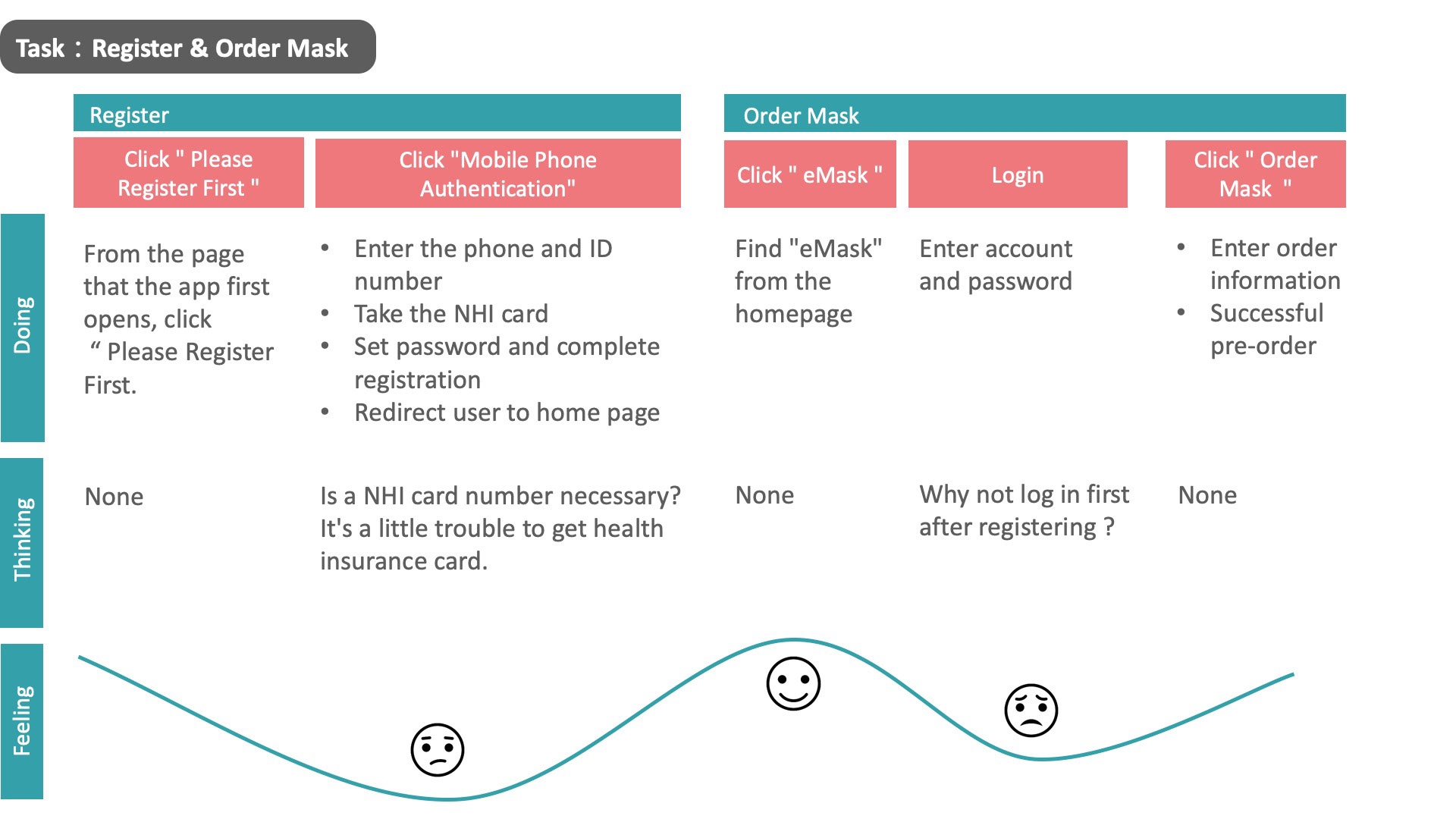

User Testing Key Findings
・The remind of the information from our Register & Login make users feel intimate.
・Not sure about the cancelation. Like "Can I cancel the paid order?" or "Will it be cancelled once I click the cancel button?"
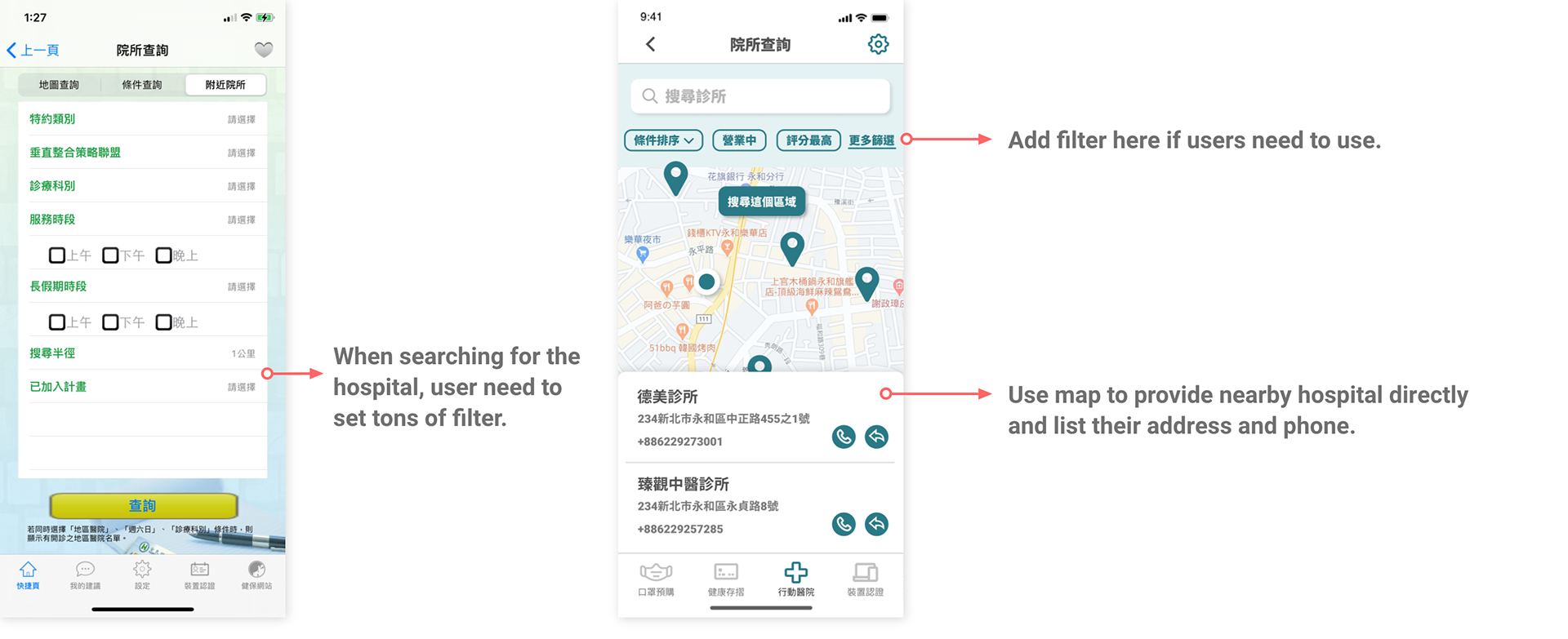
・Not sure about the service of "Find nearby pharmacy". Like not sure which kind of mask is sold out.
・Some information is not required when finding nearby hospitals.
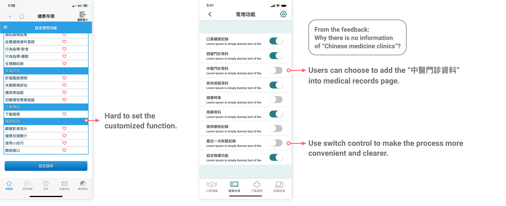
・Need more function when finding medical records. Like the complete medical record of a certain record or information of Chinese medicine clinics.
. . .
05. Design Iteration
Based on the findings we got from the user testing, we try to revise our design and move on to the process of High-Fidelity Mockups. After finish the Mockups, we will get more participants to test our design.
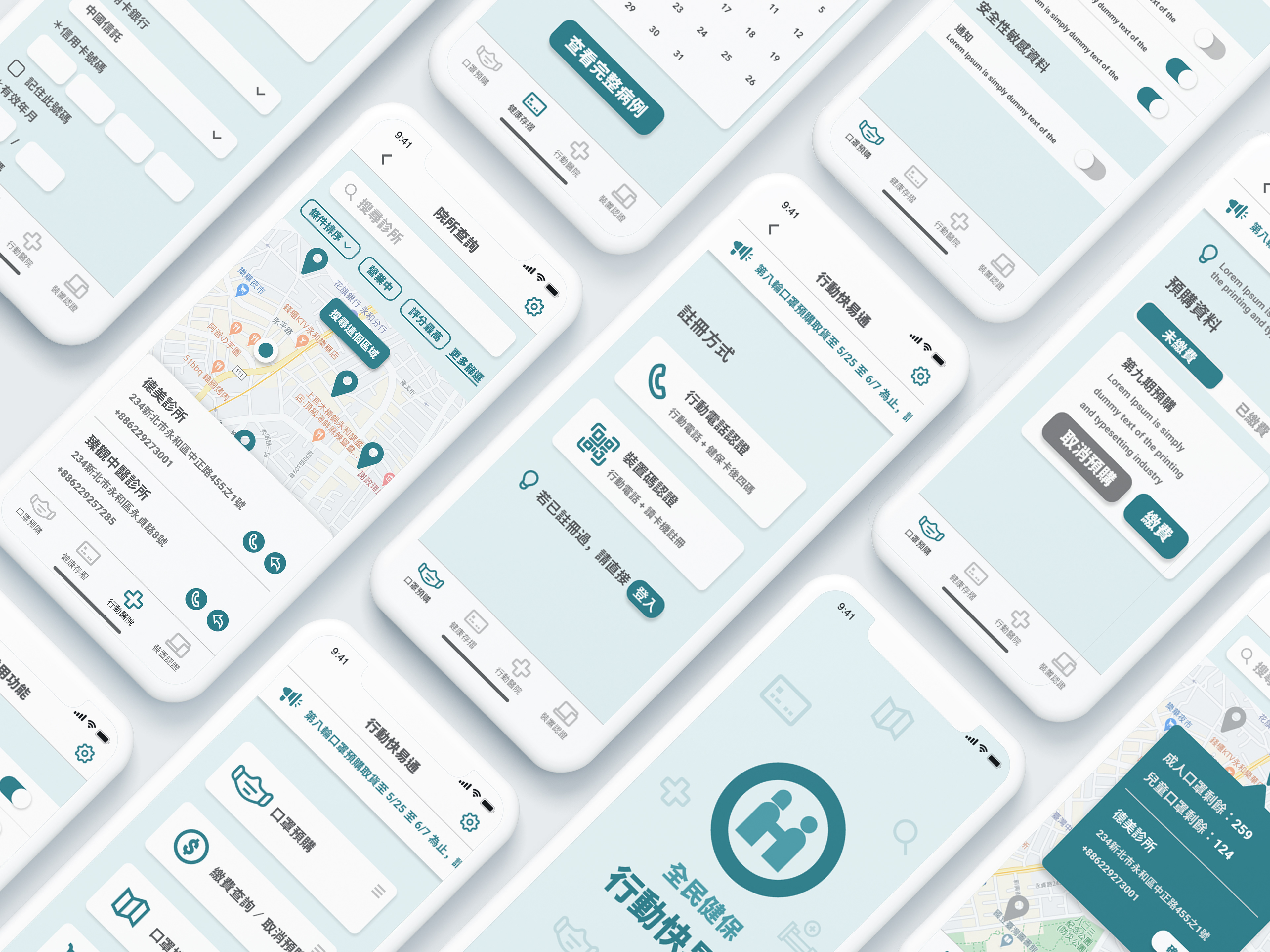
06. Hi-Fi Mockups
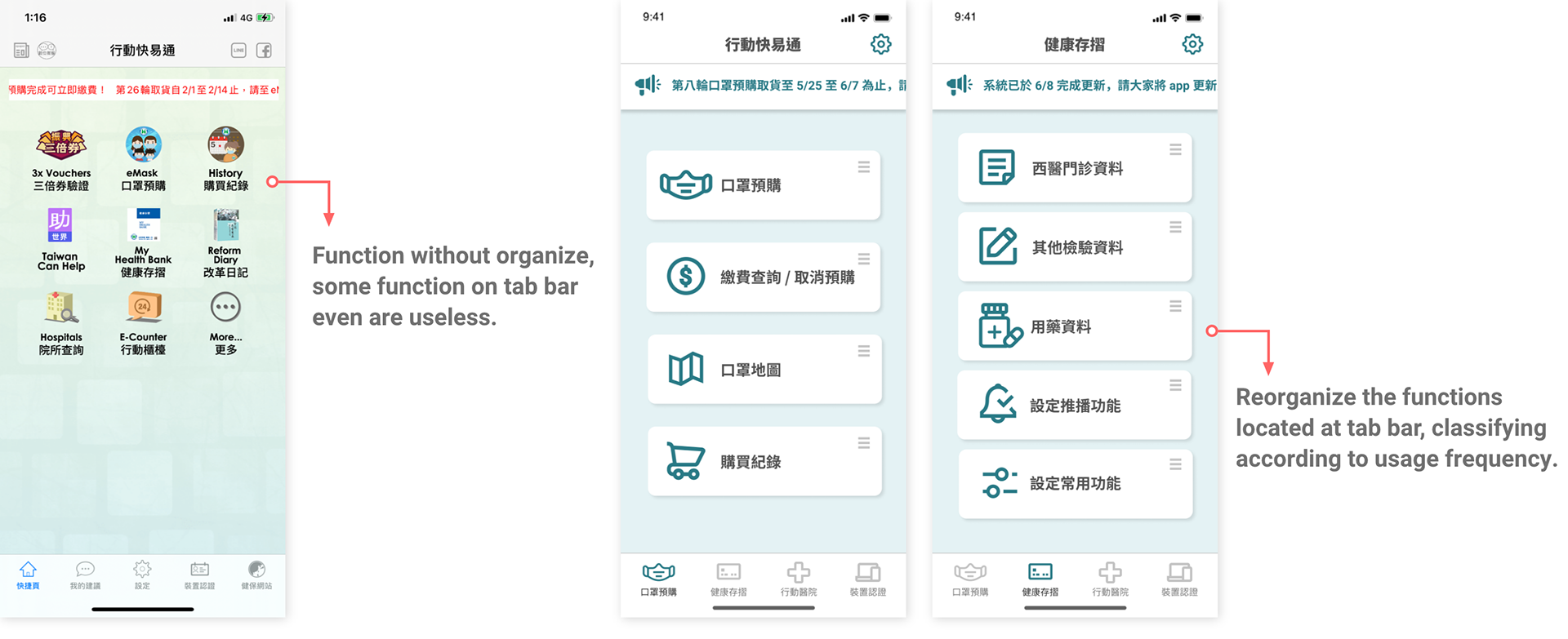
This part is all made by myself with Figma. Basically the visual design is the screen-by-screen pixel-perfect visualization of the wireframes in detail. Cyan (mix color of blue and green) and white were chosen as the main colors because they can be universally associated with medical treatment and the color of logo of National Health Insurance is blue and green as well. The icons were kept light and refreshing to make the page look simple and concise.
The left part is the original pages from the app, and the right part is our design.


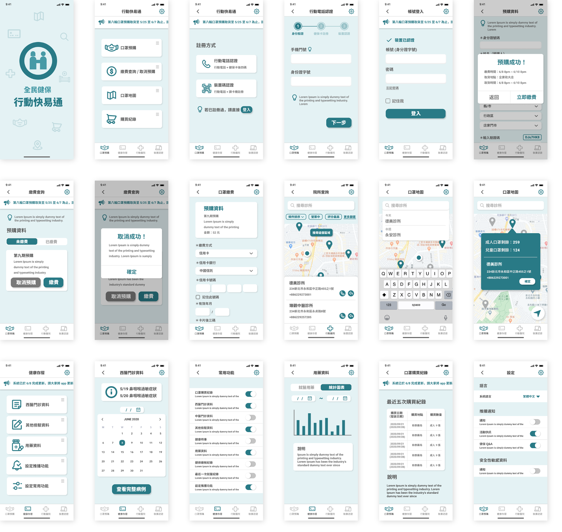
Most of the mockups designed by me
. . .
07. Prototype
. . .
Insights and Future Plan
After our last user testing for the final design, we found that respondents generally feel smooth in using the app. However,
most people only use the app to pre-purchase masks, and not use the rest of the functions.
The reason is mostly
because they still do not know the existence of those functions.
For the long-term operation of the app,
1. other functions should be promoted.
2. it can become a one-stop platform for integrating various medical resources, like integrate the registration system of each hospital or analyze and provide suggestions for physical fitness.
. . .
What I Learned
Since this course is focused more on user experience, I participated in many different research methods that I haven't use before in the early stage of the project which makes me more familiar with user experience design.
Besides, it was my first time in charge of whole visual design of one project, I really enjoy the process of communicating ideas through visual creation.
Last, because when we are doing this project, in fact, government departments have been updating this app synchronously. Sometimes we have to change the design back and forth to meet the current situation, which also makes design more efficiently.
. . .
Conclusion
It's was a really nice experience working with a team to redesign an existing app. During the project, I can always get different perspectives from my team members which make me become a designer that think more thoughtfully. Although this app became popular because of the covid-19 epidemic, we hope that even if the epidemic has passed, this app can still be useful in everyone's daily life.